TYPE01
OVERVIEW
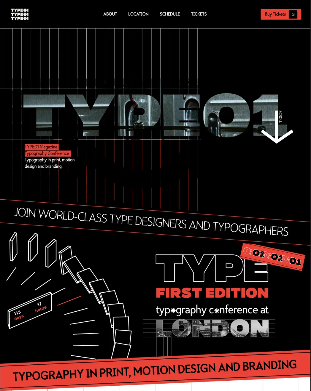
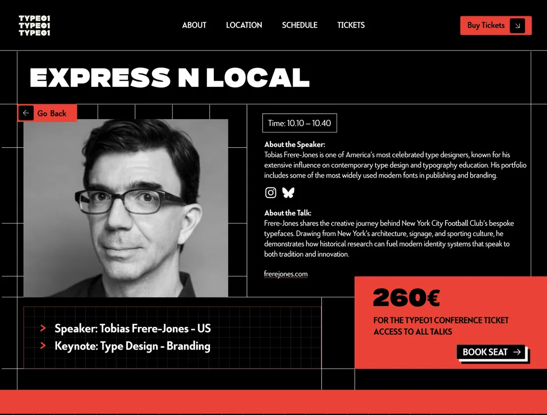
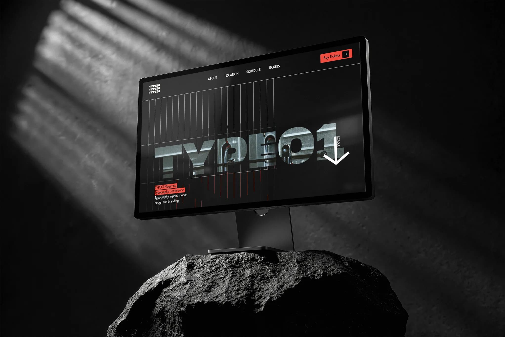
For TYPE01 Magazine’s typography conference 'Typography in print, motion design and branding', I designed a responsive Web Design that clearly communicates the program, speakers, and registration. The brief required a more experimental approach than the corporate site while staying on brand, prioritizing clarity for a emerging designer audience and smooth sign-up.
SOLUTION
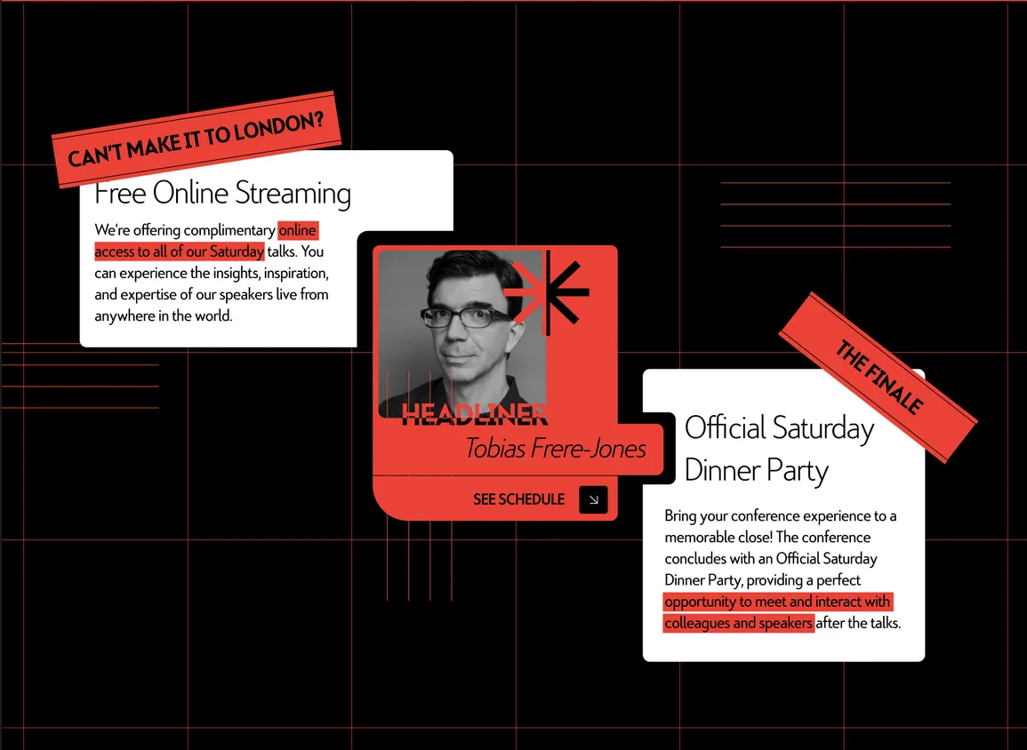
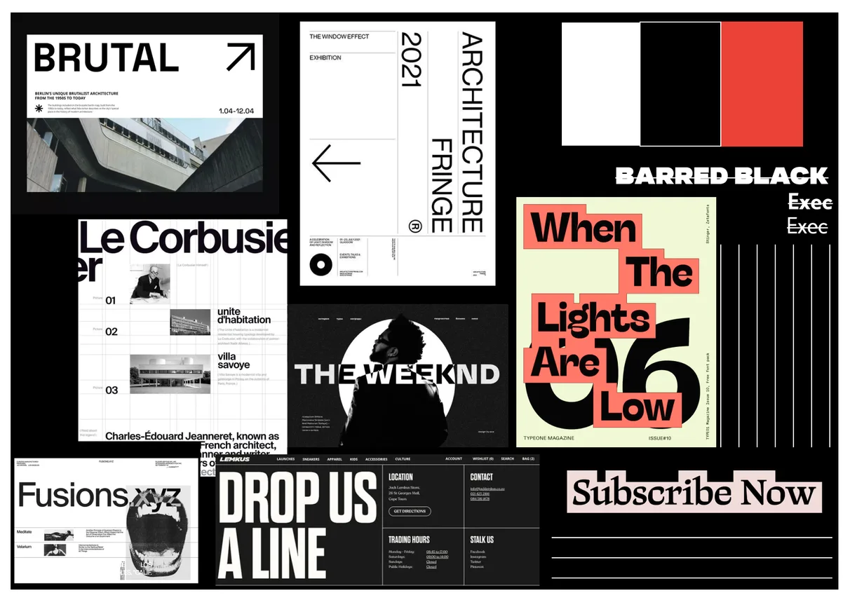
I designed the page so the typography itself turns into the visual language. A strict black, white, and alarm-red palette keeps the experimentation controlled. Oversized numerals, torn-ribbon tags, and asterisk motifs break the single-column mobile-first layout into scannable, editorial-feeling chunks, while high-contrast black-and-white photography grounds the abstraction in the real London venue.


DESIGN//SNIPPETS
Styleboard//001
Web//DSGN//002